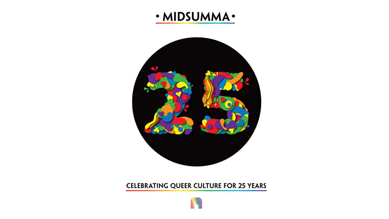
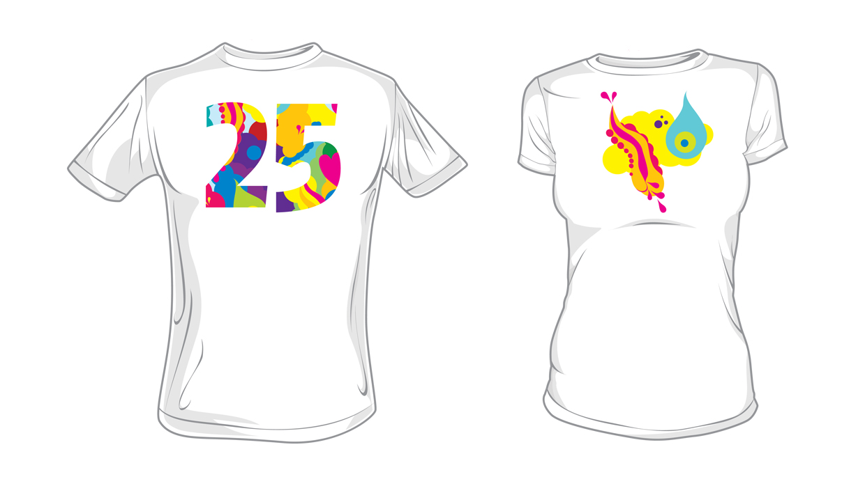
Northside Creative was commissioned by Midsumma to produce the branding and all the marketing collateral for their 25th Year anniversary festival. The final design they chose is featured above but due to a last minute board decision our design was pulled in favour of something the committee produced in-house. Below is their final concept.
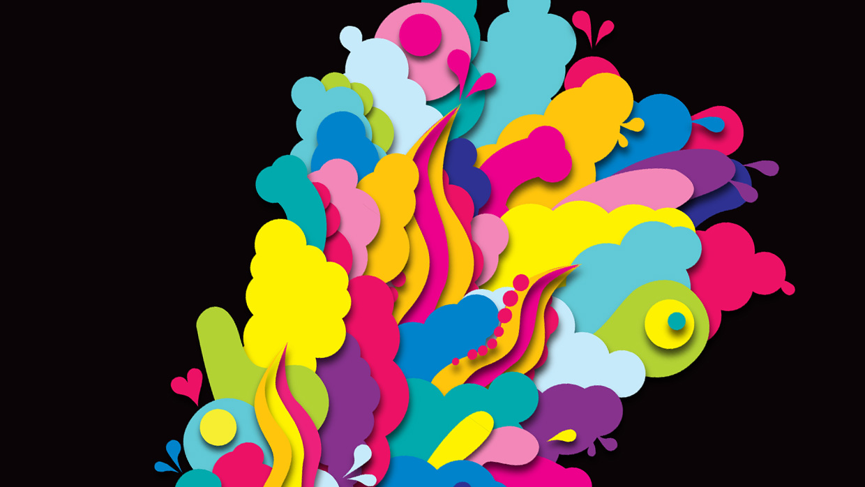
A few words about our concept: This concept revels in all things sexy, fun and vibrant, and firmly situates itself in 2013’s forthcoming ecstatic queer Melbourne summer. It has been designed with our diverse and colourful Community in mind, and aims to include and excite people of all genders, sexualities, ages and nationalities. Our community knows how to party, and on Midsumma’s 25th anniversary Northside Creative Studios have worked to channel an explosive camp party aesthetic rooted in bold abstract designs and evocative shapes.
Aligned with slick mainstream graphics, on first glance the imagery looks like it could be promoting a high profile mainstream summer festival or party, but upon closer inspection (perhaps seated on a tram, or waiting in traffic) the viewer has space to decipher a series of cheeky graphics. This concept acknowledges that the branding will be digested over a period of months, and aims to remain interesting while not being offensive or too explicit.
The palette references the effective power of the queer Rainbow Flag and uses a confetti of rainbow colours to celebrate this landmark anniversary.
Midsumma is committed to presenting an annual arts and cultural festival that, within a safe and healthy environment, celebrates the pride and diversity of Victoria’s lesbian, gay and allied communities.


